The Difference Between a Mobile Website and a Responsive Website
Mobile web design and responsive web design are often mistaken for one another, but they are drastically different ways to approach a mobile strategy.
Every day, you probably access the web via several devices. You may use a desktop at work, your cell phone on your lunch break, and your iPad while you’re back at home doing online shopping or watching television.
For web users, the growing variety of devices available to access the Internet is terrific. This evolution has essentially democratized the web by allowing anyone with a cell phone or even an iPod to use the Internet from anywhere in the world.
However, for web designers and developers, this rapid, seismic shift in the way users access the web has kicked the industry into high gear in an effort to keep up. Web designers scrambling to accommodate several different screen sizes and mobile browsers have never worked harder to engage audiences on the web.
Put simply, the notion that a single website could look and function the same no matter if it were being viewed on a desktop or a mobile phone was virtually non-existent just a few years ago.
But first came the mobile website…
What is a Mobile Website?
A mobile website is a second version of a website that is revealed only when a website is visited through a mobile device. Sensing a mobile browser, a mobile version of a website will appear automatically if a user is attempting to access a site on their phone or tablet.
The upside to creating a mobile website is its functionality and not necessarily its aesthetics. A mobile website is essentially a paired-down, simplistic version of a regular website. Though it may perform optimally on a mobile device, it leaves much to be desired in the way of design, branding and engagement. Though user friendly, a mobile website offers users much less than its desktop/laptop-friendly counterpart in most cases. In other words, the user experience is not a seamless one.
Here’s a good example:
You’re an online retailer who sells designer shoes. Your potential customer has her eye on a certain pair of shoes on your website to go with a dress she will shop for at a boutique the next day. Her plan is to pull up the pair of shoes on her phone while she shops to make sure they pair well with her new dress.
When she visits your website from her phone, it looks different. Plus, she now can’t find the pair of shoes she had her heart set on because your latest collection still hasn’t been updated to your separate mobile website. So, she buys a pair of shoes from the same shop she bought her dress in.
You lose the sale.
Obviously, this scenario is an extreme example. It also outlines a perfect storm of events that can lead to eventually losing money. However, it helps illustrate why a mobile website may not be an optimal solution in keeping up with an ever-evolving list of requirements needed to accommodate the constantly changing lineup of devices people use to visit you on the web.
In addition to maintaining a content strategy that includes consistently updating not just one, but two separate websites, a slew of small inconsistencies and inefficiencies can eventually cause major problems in lead generation and revenue. And one more teeny-tiny (I MEAN HUGE) tip – having two different websites really confuses search engines and can wreak havoc on your SEO.
Enter responsive web design…
What is a Responsive Website?
A responsive website does exactly what it sounds like it does – it responds to the screen dimensions of the device or browser that it is being viewed on. Whether accessed on a 13” laptop or a tiny iPhone, a responsive website scales to fit any screen size.
The next generation in platform agnostic web design, responsive design uses CSS media queries to adapt to whatever a device requires in its layout. In theory, a responsive design means a user won’t have to scroll left to right to find something hidden on the page they are viewing. Every element of the page adjusts to fit within the parameters of the device - whether that's vertically or horizontally.
Here’s what I mean:
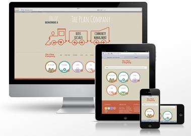
You can clearly see, from the desktop to the cell phone, the content of The Plan Company’s homepage adjusts accordingly. Although the navigation is simplified, the aesthetic, imagery and feel of the desktop version of the website remains intact – so does the user experience.
In addition, the webmaster experience drastically improves with responsive design. Since a single website can look great from the tablet to the desktop, gone are the days of having to administrate two different websites. A single SEO or content strategy, instead of two, is obviously more efficient to manage! It cuts back on errors and inconsistencies that can come between you and your website leads.
Responsive design not only satisfies the screen sizes of any device out there right now, it will also satisfy the requirements of devices that aren't even built yet. That makes a responsive approach the key to longevity on the web. We suggest a responsive design to our clients moving forward as more and more users across demographics and industries use a seemingly unending number of varied devices to access content on the web. Of course, every client and their specific audience is different. If you have a question related to whether or not you should plan for a responsive web design, feel free to contact us at info@iexposure.com and we'd love to have a casual chat and answer your questions.
Images by adactico & Alvaro Rubioc and licensed by Creative Commons.